From Wood Type to a Wall of Posters
See how wood type and poster walls shaped public messages, and learn to separate a poster’s original design from the clues left by its display.
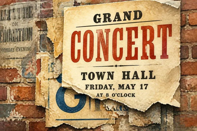
A torn concert notice clings to a brick wall, its headline partly hidden beneath a newer sheet. The contrast between bold letters and paper layers makes the wall a record of how printed messages enter public space. Wood type and poster walls connect through repetition, but each belongs to a different part of that visual story.
Wood type and posters
Wood type is movable letterpress type made from wood. Printers arranged individual characters in a forme, applied ink and pressed paper against them. The method let a printer reuse letters in different arrangements, though the available type, equipment and skill shaped what could be made.
It is tempting to describe wood type as simply better for large lettering than metal type. That comparison needs care: printing practices and materials varied, and a particular printer’s stock and press mattered. A safer point is that wood type was one option for setting display lettering. Its presence in a poster tells us about the chosen materials and process, not by itself about why a design succeeded.
Posters carried printed designs into shared settings such as notice boards, hoardings and shopfronts. There, a sheet could sit beside other announcements or cover part of an older one. The wall became more than a support: its changing arrangement affected how each poster was seen.
Reusable letters, changing layouts
Movable type allowed printers to assemble wording from existing characters rather than carve every letter for each impression. They still had to select sorts, space and align them, then secure the arrangement for printing. Missing or damaged characters and the available type sizes could influence the result.
Reusable letters also brought limits. A long headline might not fit the available space, while large display lettering left less room for supporting information. Printers had to balance the words, type and sheet rather than assume the material would suit every design.
Think of type as a box of reusable building blocks: the pieces can form different arrangements, but the pieces on hand shape the possibilities. This is only an analogy; printing also depended on the press, ink, paper and the printer’s decisions.
How lettering guides attention
Posters often combine a prominent line with smaller details. A reader may notice a name or event first, then approach to read a venue or instruction. Size, spacing, weight and placement can establish that order, although the intended hierarchy is not always the order every viewer follows.
Repetition could make the same wording and letterforms appear across multiple printed copies. The wall then introduced variation: one copy might stand alone, while another met competing notices, damage or partial coverage. The printed design could remain consistent even as its surroundings changed.
Say a local hall has a short line of large wooden letters available for a concert notice. The organiser sets the concert name in that line, then puts the venue and time in smaller type beneath it. The expected result is a clear visual distinction between the event name and the practical details; if the name does not fit, the organiser must shorten it or use a different arrangement.
Reading the poster wall
A poster is printed as a sheet, but its public appearance depends on placement and what happens to it afterwards. New notices may overlap older ones; paper can tear, fade or come loose. These changes can make the wall’s composition difficult to reconstruct, so treat visible traces as clues rather than a complete account.
Use this checklist to separate what you can observe from what you can reasonably infer:
- Check the paper edges. If one sheet visibly sits over another, record that local overlap; if the edges are hidden or torn, leave the order uncertain.
- Check for exposed fragments. If older lettering or colour appears below a sheet, describe the fragment; if no fragment is visible, do not infer what the covered poster said.
- Check the lettering hierarchy. If one line is larger or heavier, note it as visually prominent; if several lines compete, compare their size and placement before naming a clear first read.
- Check the setting. If the sheet is on a formal notice board, describe that context; if it is on a rough wall or shopfront, record that instead and avoid assuming who placed it.
- Check damage and stains. If a tear interrupts a word, mark the text as incomplete; if the mark does not obscure the design, distinguish it from the printed image.
- Check the surface around the poster. If nearby notices crowd its edges, include that in your account of how it appears; if it stands alone, describe the open space without assuming it was deliberately arranged.
Imagine you are looking at a notice whose lower edge covers a strip of older paper. You can see a blue curve and part of a letter underneath, but no complete word. Record that the newer sheet overlaps an older printed layer, then leave the earlier message unidentified. That answer preserves what the wall shows without turning a fragment into a claim.
What can a layered wall tell you?
An overlap can indicate which sheet covered another at that spot, but it cannot establish the full history of either poster. A sheet may have been repaired, partly removed or shifted. Describe the visible relationship before proposing a sequence.
Large type shows visual prominence, not necessarily the maker’s full intention or the audience’s response. Compare the headline with smaller copy, placement and neighbouring material. Keep the design’s printed features distinct from later damage and display conditions.
Questions about poster walls?
Can you tell which poster came first?
An intact overlap can show that one sheet covered another at that point. If edges are missing or disturbed, the wider sequence remains uncertain.
Does large type mean the message was important?
It shows that the word or phrase was given visual prominence. It does not, on its own, establish the maker’s motive or the audience’s response.
Why do the same posters look different on different walls?
Each copy sits among different surfaces, notices and traces of wear. Those surroundings alter the view without changing the original printed design.
Is every visible layer part of the design?
No. The printed sheet carries the original design, while later paper, damage and placement change how it is seen. Those additions are evidence of the wall’s use, not necessarily the designer’s choices.
When reading a poster wall, keep the printed image and its later surroundings in view at the same time. That distinction helps you recognise both the choices made in setting the letters and the changes that followed when the sheet entered public space. For wood type and poster walls, the most reliable account begins with what is visibly there and marks uncertainty where the layers no longer give a clear answer.