The Eye Follows Edges Before It Finds the Centre
Learn how contrast, alignment and spacing guide attention across a plain page layout, so readers can follow its message without arrows or decoration.
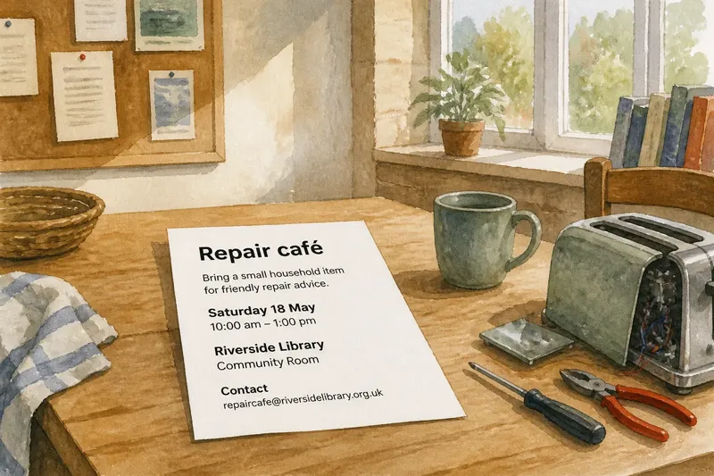
A notice for a community repair café sits on a kitchen table: one sheet of white paper, black type, a date, a place and a short invitation. Nothing is illustrated. Yet the eye does not land everywhere at once. It catches the darkest edge, follows a line of text, then moves towards the next aligned element. A plain page layout can direct attention through contrast, alignment and spacing, without arrows or decorative devices.
The useful question is not simply what should be largest. It is how one visible feature makes the next one easier to find. Edges, gaps and repeated alignments form a route. Treat them as parts of the composition, and an otherwise ordinary notice can lead a reader from its subject to the practical details.
The starting page
Imagine you are preparing a one-page notice for a repair café in a local library. The event offers help with small household objects. The sheet will be pinned to a noticeboard, where people may glance at it while passing. The information is settled: the event name, a brief description, the date, the venue and a contact method. The design problem is to make those details readable in a sensible order.
Start with a deliberately plain arrangement. Put the event name at the top, a short line beneath it, then the date and venue, followed by the contact information. Use black text on white paper and one typeface. Keep the elements on a shared left edge. Leave open space between groups instead of adding rules, boxes or icons.
This first arrangement is a working surface, not a finished design. Its restraint makes the relationships visible. If every item has the same weight and the same distance from its neighbours, the reader has little help deciding where to begin. If the page is crowded, the gaps cannot distinguish one kind of information from another. The task is to adjust relationships, not to decorate around them.
Contrast sets direction
Contrast is a difference the eye can detect: dark against light, large against small, bold against regular. On the notice, the event name can carry the strongest contrast through a heavier weight or larger size. The description should be quieter. The date and venue need enough presence to be found quickly, but they should not compete with the title.
Think of contrast as a lamp illuminating one edge of a path. It does not carry the reader through the whole page; it makes the next useful feature visible. If the title is emphatic and the date is nearly invisible, attention arrives at the subject and stalls. Give the date a clear, secondary emphasis, perhaps with bold type, while keeping the rest of its line calm.
Limit the number of competing signals. Making every line bold, capitalised or oversized removes the distinction between leading information and supporting detail. Instead, decide which item deserves the first glance, then choose one or two quieter cues for the information that follows. A controlled hierarchy feels less like a sequence of demands and more like a clear conversation.
Alignment makes a route
A shared edge gives the eye a stable line to return to. Align the title, description, date, venue and contact details to the same left margin. The repeated starting point connects separate blocks, even though there are no arrows between them. The eye can descend along that edge and read across each line when its content calls for attention.
Alignment also helps expose accidental disorder. If the venue shifts sideways without a reason, it may look detached from the date. If the contact line begins farther in, a reader may mistake it for a note or a sub-item. An intentional offset can be useful, but it should communicate a relationship. On this simple notice, one consistent edge is the clearer choice.
Keep line lengths under control as well. A short description can sit directly beneath the title, while event details can be grouped into compact lines. If one line stretches much farther than the others, the reader’s gaze must travel across an uneven field. A tidy edge does not require identical line lengths; it requires starts that feel related and endings that do not create needless visual noise.
Spacing groups information
Whitespace is not unused space. It tells the reader whether two items belong together or should be read as separate parts. Keep the gap between the title and its description relatively close, then leave a more obvious pause before the event details. Give the contact information its own breathing room so it reads as a distinct next action.
Imagine each group as an object on a shelf. Items placed close together seem to belong to one set; a larger gap marks the next set. The same principle works on a page. The date and venue can sit close enough to read as event logistics, while a wider interval before the contact line separates practical arrangements from the invitation above.
Spacing also affects pace. A reader moving down the page meets a small pause after each group, rather than a continuous block of text. Too little separation makes the layout feel compressed. Too much can break the connection between a label and its detail. Adjust gaps according to meaning: keep related text near, and separate only where the reader should recognise a new group.
One layout in motion
Say you have drafted the notice with the event name, “Repair café”, followed by “Bring a small household item for friendly repair advice”, then the date, library room and contact email. In the first draft, every line is the same size, the gaps are uniform, and the email is pressed against the venue. A passer-by may notice the page but have no clear route through it.
You make three changes. First, you strengthen the event name and keep the description in regular type. Next, you align every line to one left edge. Finally, you place the date and venue in a close group, then set the email apart with a little more space. The expected observable result is a page where the title stands out first, the event details read as one unit, and the contact information is easier to locate without an arrow pointing to it.
Now check the result at the distance from which someone is likely to see the notice. If the title draws attention but the date disappears, increase the date’s contrast slightly. If the email appears disconnected, reduce its gap. These small adjustments preserve the plain character of the page while correcting the path. The point is not to force one fixed order; it is to make the intended reading sequence available at a glance.
What should you adjust?
Should the title always be the largest?
Not necessarily. It should be easy to identify, but the event date may need a clear secondary emphasis if it is the detail a passer-by most needs. Keep the title dominant enough to establish the subject, then make the next useful information visible.
Can a page guide attention without colour?
Yes. Differences in weight, size, alignment and spacing can create a readable hierarchy using only black and white. Colour may add another cue, but the page should not depend on it to distinguish the title from the details.
How much whitespace should separate groups?
Use enough to show that one group has ended, while keeping labels close to the information they explain. Compare the gaps on the page rather than choosing a universal amount: a clear difference between internal and external spacing is what matters.
Do arrows ever help?
They can be useful when a reader must follow a route or connect separated parts, but they are unnecessary if the composition already makes the order clear. Try alignment and spacing first, then add an arrow only if the page still leaves a real ambiguity.
Review the path
Before printing, look at the page as a passing reader might: briefly, from a little distance, without deliberately reading every line. Notice which feature catches your eye, where it moves next and whether the date, place and contact information are easy to find. If attention jumps to an unimportant line, reduce that line’s contrast or move it into a quieter group.
Then check the page close up for relationships that the first glance cannot settle. Confirm that the description belongs to the title, the date and venue belong together, and the contact line is separate but not stranded. A plain layout succeeds when its visible edges and pauses make those connections legible. For a plain page layout, the most useful final edit may be a smaller gap, a shared margin or a touch more weight—not another graphic element.
Keep the first version spare long enough to see what the composition itself is doing. Once contrast, alignment and spacing provide a dependable route, any added rule or symbol has a specific job to perform. If it has no job, leave the paper clear.