Serif or Sans Serif? Start with the Page's Job
Compare serif or sans serif type on the page you will print to choose a face whose letterforms suit the message, format and reading conditions.
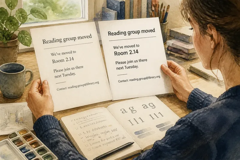
You pin a notice beside the kettle, announcing a room change and giving a contact name. The wording is clear, but the typeface can make it feel like an official circular or a friendly invitation. To choose serif or sans serif type, compare the actual letterforms in the format you will use.
Start with the letterforms
Serif letters have small finishing strokes at the ends of some main strokes; sans serif letters do not. That distinction gives you a useful way to sort typefaces, not a verdict on their quality. Both categories include designs that feel warm, formal, plain, lively or restrained.
Look at details rather than relying on a font menu’s category label. Compare the shape of lowercase a and g, the width of capitals, the roundness of bowls and the contrast between thick and thin strokes. A narrow serif and a broad sans serif may make very different impressions from what their labels suggest.
Listen to the tone
Typefaces carry associations through their shapes and the context in which they appear. A traditional serif can suit a literary programme or a formal announcement. A plain sans serif can feel direct and contemporary; a rounded or humanist sans serif may seem more approachable. These are possibilities, not fixed rules.
Imagine a library announcing that its reading group has moved to another room. You set the same heading and details in a restrained serif and a plain sans serif. The serif may feel at home beside the library’s printed programme, while the sans serif may feel more in keeping with an informal community notice. The useful decision is which face suits the setting without making the message feel unlike itself.
Inspect individual characters
When a notice includes a room number, telephone detail or web address, examine the characters readers need to distinguish. Check capital I, lowercase l and numeral 1, along with any punctuation that appears in the contact information. A clear category label does not tell you whether those particular shapes will be easy to tell apart.
Look at a short sample in the exact typeface and style you are considering. If a character is ambiguous, try another face or choose a different style within the family. Keep the wording identical when comparing candidates so the letters themselves are the main difference.
Check the file and font family
Before setting a longer document, check that the font file includes the styles you need, such as italic and bold, and that the licence permits your intended use. In desktop publishing software, inspect the family menu rather than assuming a similarly named font has the same character set or style options. If a font will be shared with a printer or colleague, confirm how it will be supplied or embedded.
Serif and sans serif families can differ in how they handle italics, numerals and punctuation. If a particular style is missing, the software may substitute another face or create a synthetic version. Check the exported PDF at the intended size; if the type has changed, use a suitable family or ask the printer about an appropriate font workflow.
Which typeface fits?
Does a serif always feel formal?
No. Serif designs vary widely in their proportions and details, and the surrounding material affects their tone. Judge the specific face in the context where readers will encounter it.
Is sans serif better for screens?
Not automatically. Screen rendering, size, contrast and the design of the individual typeface all matter. Check the actual text on the device and at the size readers are expected to use.
Can the two categories work together?
Yes, when each face has a distinct role, such as a heading and a body text. Compare their letter shapes and tone together, and remove one if the pairing feels distracting.
What if the typeface lacks italics?
Check whether the family offers a genuine italic style before applying the software’s italic button. If it does not, choose a family with the style you need or leave the text in regular type rather than using a visibly distorted substitute.
Make a useful comparison
Use this checklist with the actual text and format. Each result points to a practical next action:
- Check the lowercase a and g in the chosen face; if either shape feels out of character for the publication, then compare another family, or keep it if the shapes suit the intended tone.
- Check capital I, lowercase l and numeral 1 in any contact details; if they are hard to distinguish, then choose a clearer face, or retain the candidate if the notice does not rely on those characters.
- Check that the font family contains the regular, bold and italic styles you plan to use; if a needed style is missing, then select a family that supplies it, or simplify the design to use only available styles.
- Check the font licence for your intended print or digital use; if the use is not covered, then find a suitable licensed alternative, or ask the rights holder for permission before proceeding.
- Check the exported PDF against the document on screen; if the type has been substituted or altered, then adjust the export or font handling, or consult the printer before sending the file.
- Check the text on the device or printed format readers will use; if the letterforms are unclear there, then revise the face or size, or keep the design if the intended readers can distinguish the text comfortably.
Say you are preparing a library notice with the heading “Reading group moved”, a new room number, and a contact email. You compare a restrained serif and a plain sans serif using the same wording, then inspect the room number and email in both. The serif has a lowercase l that is easy to confuse with numeral 1 in the address, so you rule it out for that version; the sans serif distinguishes them and has the bold style needed for the heading. You check that its licence covers the planned print use and export a PDF, then choose it if the exported file preserves the characters. The trade-off is a less literary tone in exchange for clearer details.
For a final decision, compare the specific faces in their intended setting, not serif and sans serif as abstract camps. The search phrase serif or sans serif type gets you to the basic distinction; the letterforms, font files and reading context determine which one belongs on your page.